Nubrixy 2.4: A New Look, Same Game
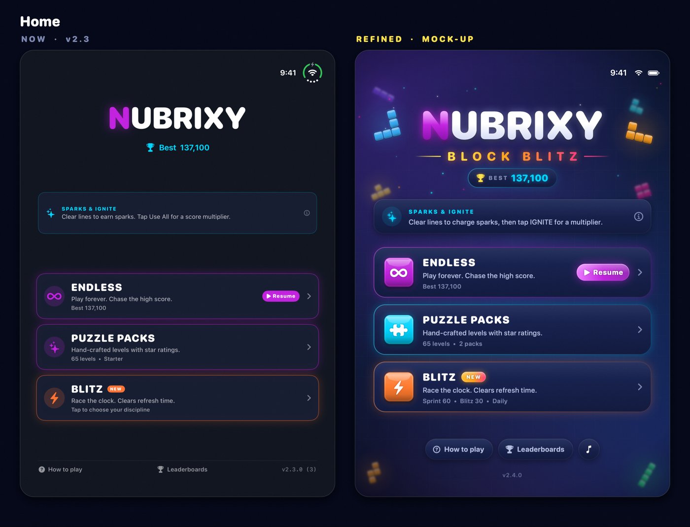
Nubrixy has had a facelift. Version 2.4 swaps the flat, dark screens for glass menus, glossy neon blocks and a glowing board, and adds an original soundtrack. Here's how a redesign of every screen went in without moving a single button.
Why now
The App Store header and icon got a neon refresh a while back, and ever since, the app behind them looked like it belonged to an older game. The menus were plain dark cards, the tiles were flat colour, and the board was a grid with nothing much going on. Working on Neon Swarm and all its glow made the gap hard to ignore.
Refine, don't redesign
The one rule was that returning players should find everything where they left it. The layouts, the flows and the rules didn't change; only how they look. That made the work much easier to scope: screen by screen, the question was never "what should go here?", only "what should this look like?"
Before touching the app, I rendered mock-ups of the home screen and an Endless game, and a style tile that pins down the whole look on one page: the navy backdrop, the glass surfaces, the brand magenta, a cyan and an orange for Puzzles and Blitz, the gold-to-pink gradient saved for rewards, the type scale, and the blocks themselves. Once that page looked right, every later decision was a matter of matching it.

One set of tokens, two renderers
Nubrixy is SwiftUI around a SpriteKit board, and the two have never agreed on colour unless you make them. So 2.4 starts with a single file of design tokens: colours, type roles, corner radii and motion timings. SwiftUI reads them as Color, SpriteKit and Core Graphics read the matching UIColor, and both are defined in the same place, so a tweak to the brand colour reaches a menu button and a board tile at the same time.
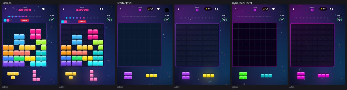
The textures are still drawn in code rather than shipped as images. Each tile, halo, well and button is drawn once in white and tinted at runtime, so one texture serves every colour and stays sharp at every size, iPad included. The glossy look comes from layering: a soft halo underneath, a glass tile on top, a highlight across its upper edge.
Glass, sparks and a soundtrack
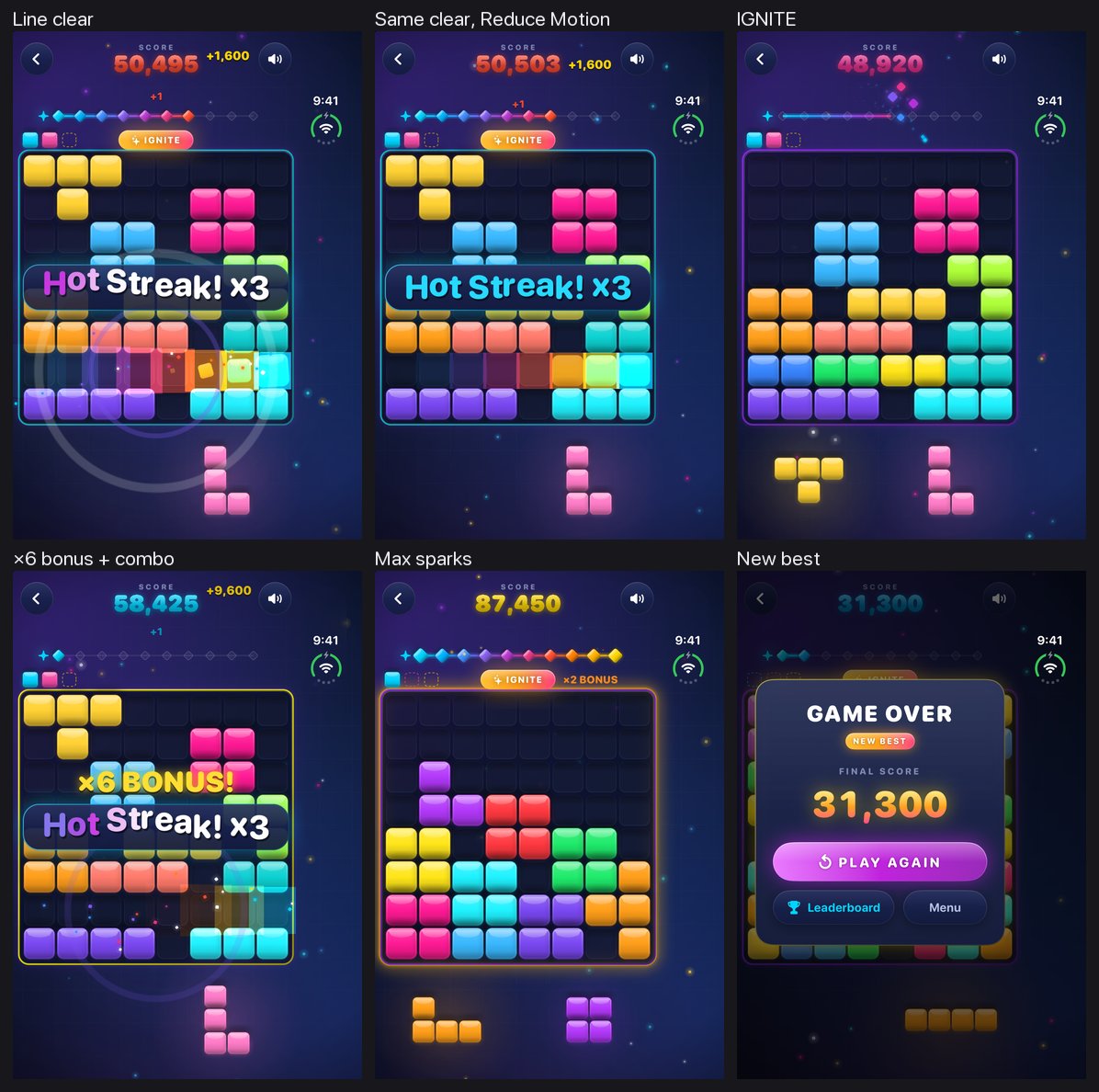
With the board done, the rest followed the same pattern: a shared glass backdrop behind every screen with two colour washes in the mode's tint and some slowly drifting dust; glass cards and pop-ups; neon pill buttons for the main action and quieter glass ones beside them. The HUD got a glossy score, a proper spark rail with diamonds that fill as you clear, and an IGNITE pill you can't miss.
Effects were rebuilt around one spark particle and one celebration palette, so a line clear, a combo callout and an IGNITE burst all look like they come from the same game. Every one of them has a calm version for Reduce Motion: tiles fade instead of popping, callouts fade in place, and nothing shakes or spins.
And for the first time, Nubrixy has music, with its own switch on the home screen so it can be turned off without losing the sound effects.
Paying for the glow
A look like this runs all the time, not just when something happens, and that costs battery. So the decoration has a budget. In Low Power Mode, or when the phone reports it's getting hot, the dust stops drifting, the board glow and the spark pulse hold still, and the wordmark stops breathing; one-off effects still play. Measured in the simulator, that cuts CPU use by about 85% on the home screen and in an idle game.
The last pass was the unglamorous one: every small text at 4.5:1 contrast against the lightest glass, menus that follow the Text Size setting (with layouts that reshuffle rather than clip when the text gets big), and refined haptics for picking up, dropping and clearing.
Shipped
2.4.0 is on the App Store with new screenshots and previews for iPhone, iPad and iPhone Duo. If you played before, it should feel like the same game in nicer clothes, which was the whole idea. Have a look on the projects page, or at nubrixy.com.