New Project: Designing a Synthwave Tower Defence Game
The start of my next game: what it is, what it should feel like, and the decisions I'm making before the real building starts.
The idea
After shipping Nubrixy and Word Tack, I wanted to try a genre I've always loved playing: tower defence. Invaders pour out of a gate and follow a road to your core. You stop them by building towers on the grid beside the road, and where each one goes matters.
The twist is the look. It's synthwave: bright neon on a dark purple night, wireframe mountains on the horizon, and a grid that runs off into the distance. It's for iPhone and iPad, played in landscape.
It doesn't have a name yet. For now I'm just calling it TowerDefence.

Four pillars
Before drawing anything, I wrote down four rules the design has to follow:
- Readable at a glance. Colour tells you friend or foe, and shape tells you what something does. Defenders are cool colours, invaders are hot colours, and the environment stays dim.
- Neon that performs. The glow is the look, so it can't get more expensive as the screen gets busier. It's applied to the whole frame at once, not object by object.
- The map is the puzzle. Roads, chokepoints and special tiles should make every placement a real decision.
- Phone-sized sessions. A level should take around 8 to 12 minutes, with pause any time and 1×, 2× and 3× speed.
A shape language instead of sprites
There are no sprites in this game. Every tower, invader and shot is built from simple shapes defined in maths (circles, rings, polygons and short lines), so they stay crisp at any size and I never have to open a drawing app.
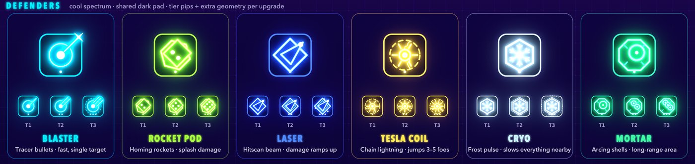
Every object follows the same recipe: a dark body, a neon outline and a bright core. The dark body is what keeps a crowded screen readable once the glow kicks in.
Towers share a dark pad, with a body that stays still and a turret that turns to aim. Upgrades add pips to the pad and extra geometry on top: more barrels, more rings, orbiting dots.
Invaders get the hot half of the colour wheel, and their silhouette tells you how they behave: pointy means fast, layered means armoured, a bubble means shielded, a cluster of tiny triangles is a swarm, a V with a shadow under it flies over the road, and a spinning star is the boss.

Shots and effects are the brightest things on screen, and they don't hang around.

One rule I set early: no sun. Almost every synthwave image has that striped sun sitting on the horizon, and I've banned it. The horizon glow, the stars, the mountains and the grid have to carry the mood on their own.
The map is the puzzle
Each map is a tile grid. Roads start at gates on the horizon and wind across the board to your core, and you build on the tiles beside them. The interesting part is what the roads do: two roads that merge into one, or a road that loops back across itself so towers in the middle get two shots at everything.
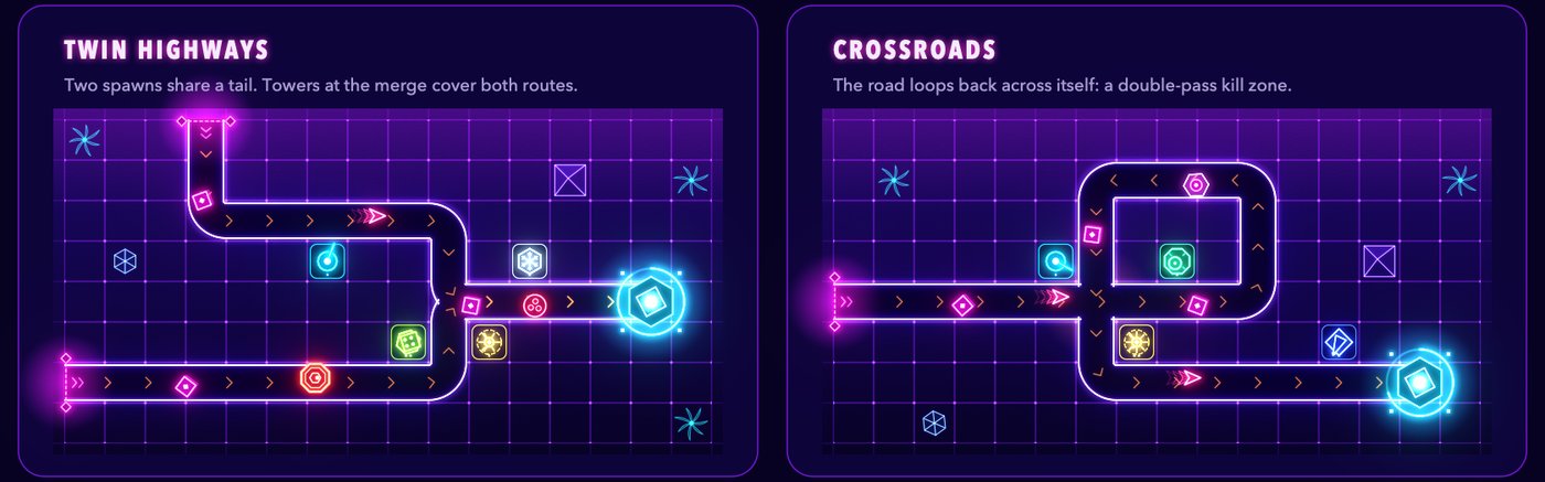
A level is just data: one file holding the map, the waves and the rules. Adding a level shouldn't need any new code, which matters when the goal is lots of them.
Why Metal this time, and not SpriteKit
Nubrixy used SpriteKit for the board and SwiftUI for everything around it, and that split worked well. So why not do the same again?
Because this look is mostly light: glow, bloom and colours stacking on top of each other. That's SpriteKit's weak spot. Glow there tends to mean baking it into images or paying for expensive effects every frame. SwiftUI's Canvas is great for menus but won't hold 120 fps with hundreds of glowing shapes. And a full engine like Unity or Godot would mean extra tools and a bigger app, for a 2D game with no art assets at all.
So the board is drawn with Metal, and SwiftUI handles the menus and the HUD.
The architecture, at a glance
The game splits into three parts that each do one job:
- The rules. The game itself (maps, waves, towers, invaders and progress) lives in its own Swift package that knows nothing about screens or graphics. It can play a whole level without drawing a thing, which makes it easy to test.
- The renderer. Each frame, Metal draws a snapshot of the game. It reads the rules but never changes them, so if Metal turns out to be the wrong call, it can be swapped out without touching the gameplay.
- The shell. SwiftUI screens around the board: the splash, home, level select, settings and the HUD.
Everything comes from Apple's own frameworks, with no third-party packages. And the performance goal is set from day one: 120 fps on ProMotion screens, and never below 60 on older devices. On a game this bright, smoothness is part of the feel.
Concept art as the spec
The concept images in this post aren't paintings. A small tool draws them with the same shapes, sizes and colours the game will use, so each one is a target the real renderer has to hit. When the design changes, the tool redraws the concepts to match, so the art and the game don't drift apart.
The plan
The build order goes from the bones outwards:
- A skeleton: the project, the rules package and a Metal view.
- The shell and the first few levels: screens, progress and saves.
- Maps and roads, with invaders walking them.
- Towers and their shots.
- The look: the glow, the sky and the screen finish.
- The game loop: waves, credits, lives, building and upgrading.
- Content: more levels, and balancing them.
- Polish: sound, a tutorial, and testing on real devices.
And a few questions I haven't answered yet:
- Landscape only? Almost certainly. Portrait would need different maps and a different HUD.
- On iPad, the same maps with a taller sky, or bigger maps made for the screen?
- Stars will unlock new worlds, but should there also be upgrades you buy between levels?
- And, of course, what to call it.
Next time, there should be something to play.